PLANNING
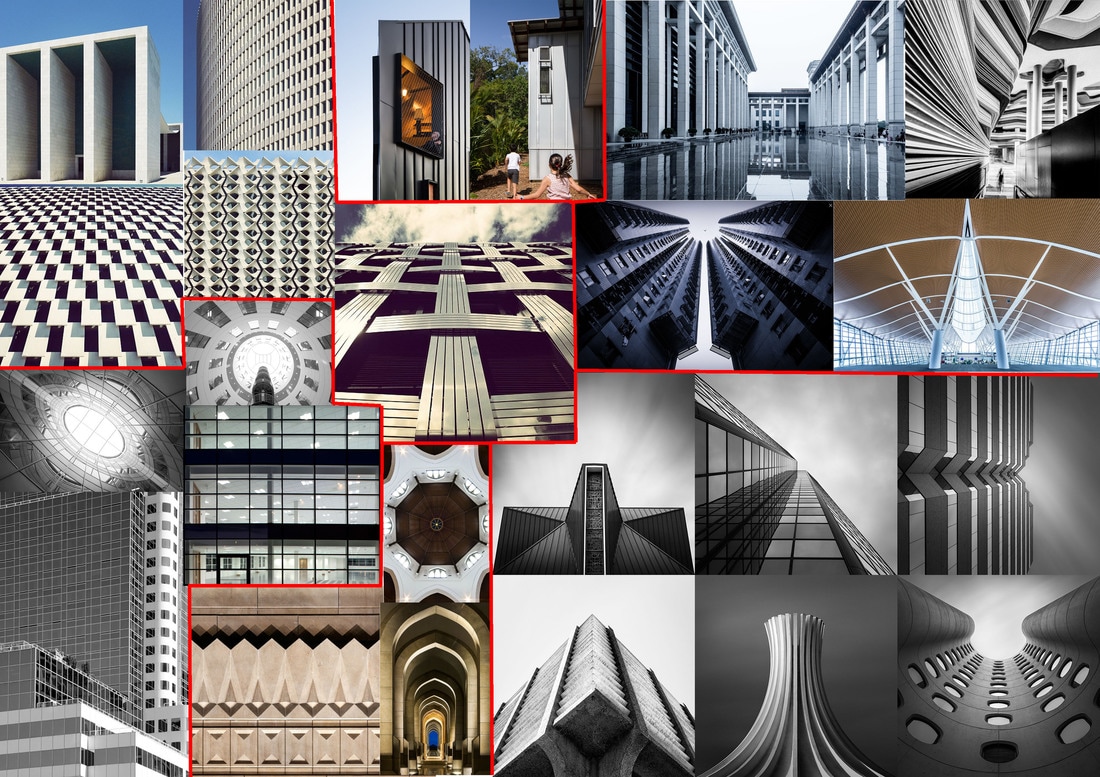
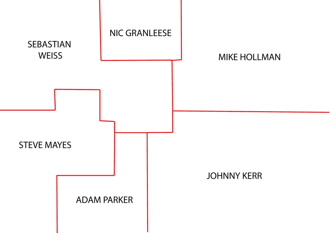
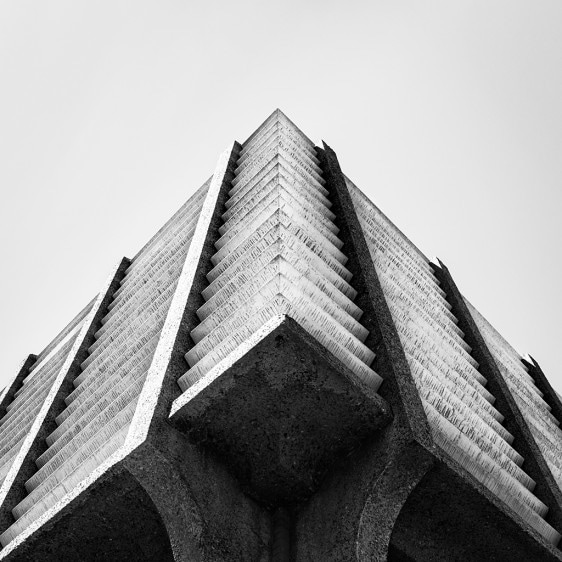
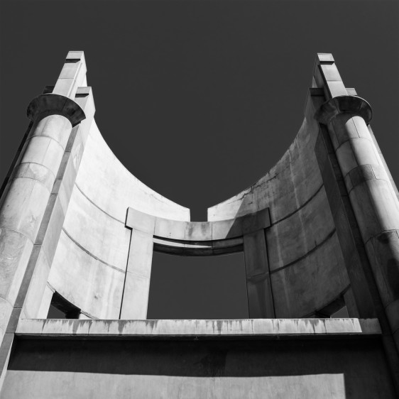
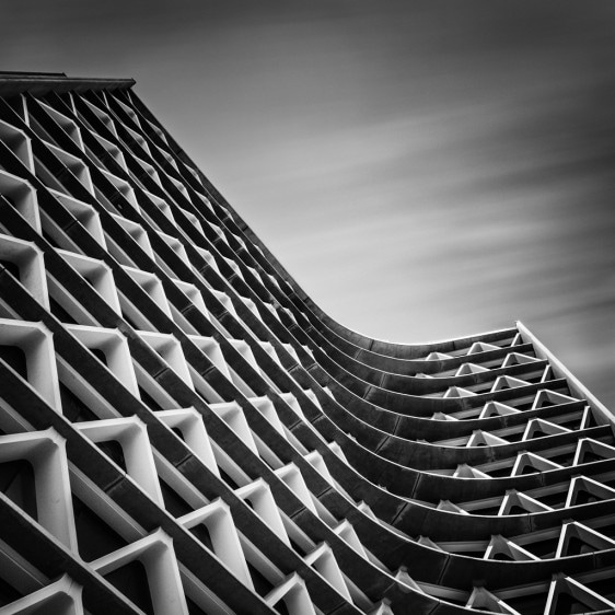
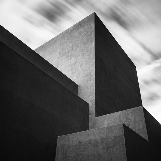
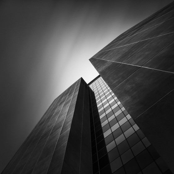
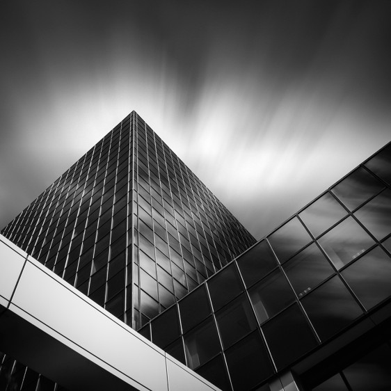
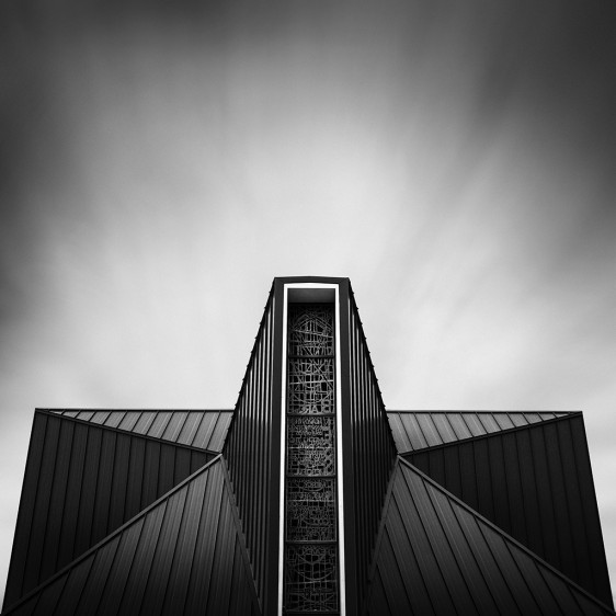
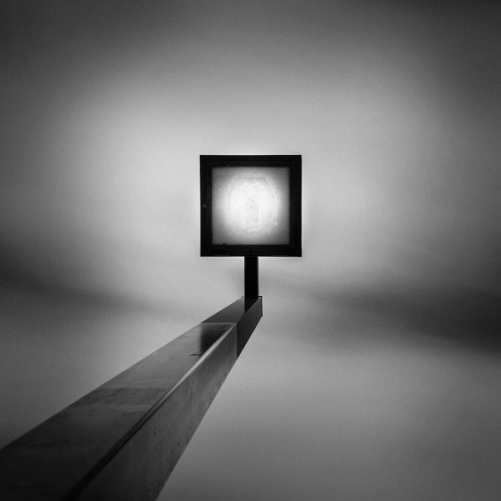
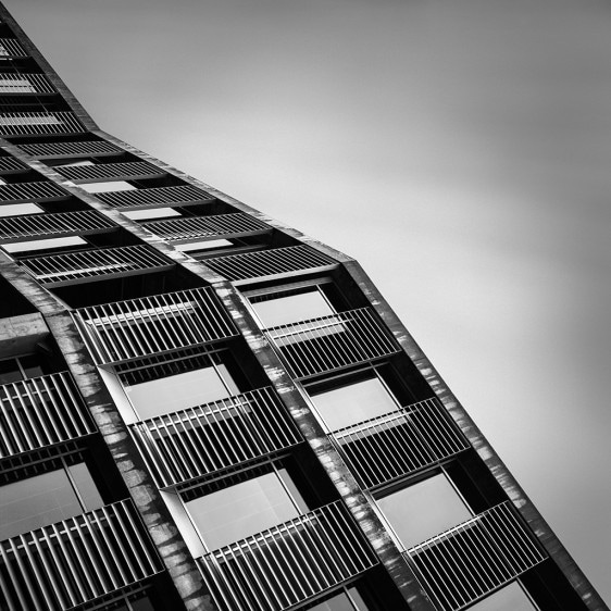
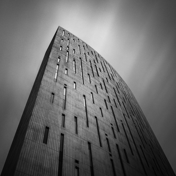
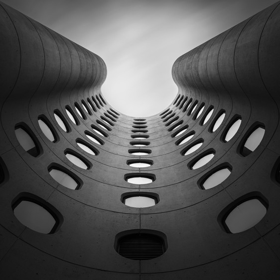
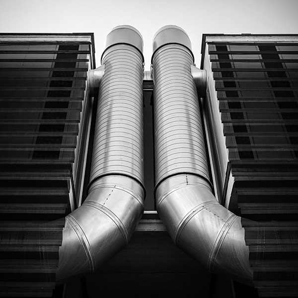
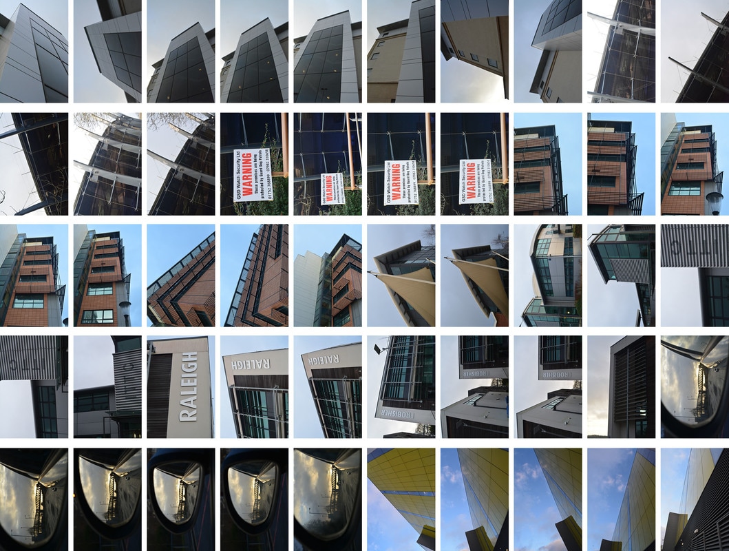
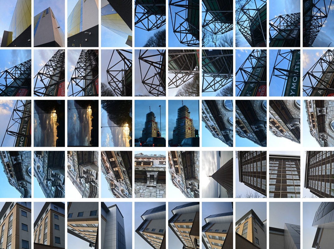
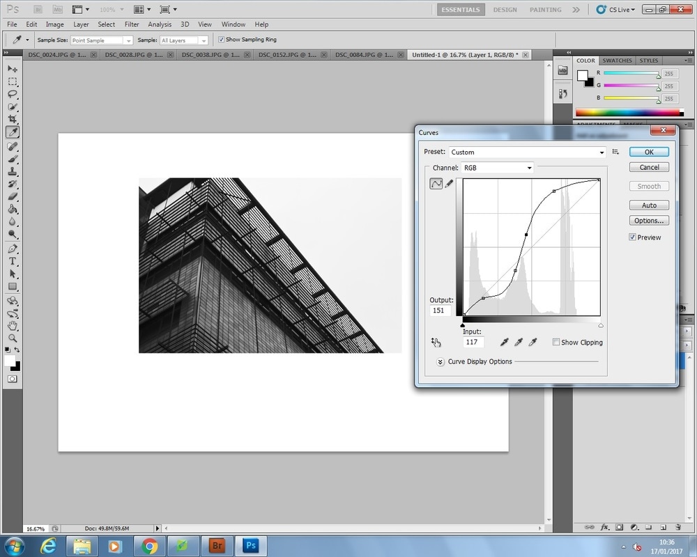
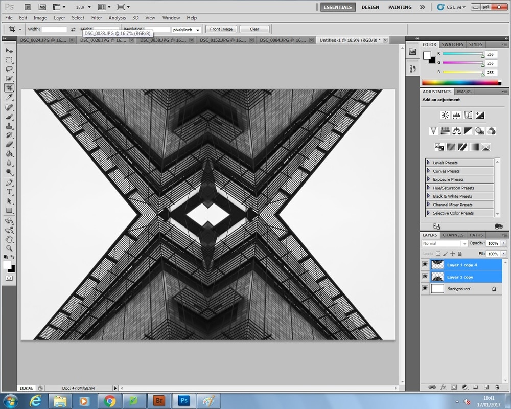
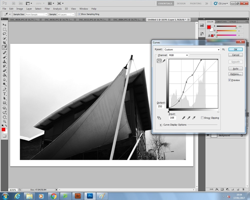
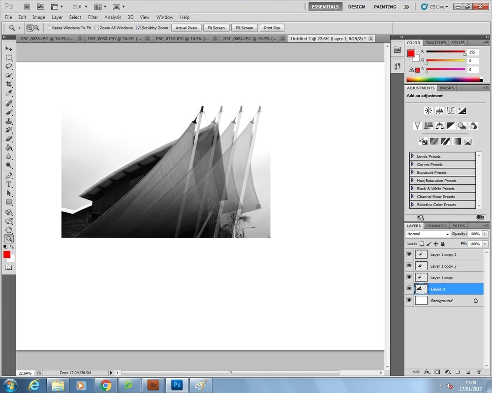
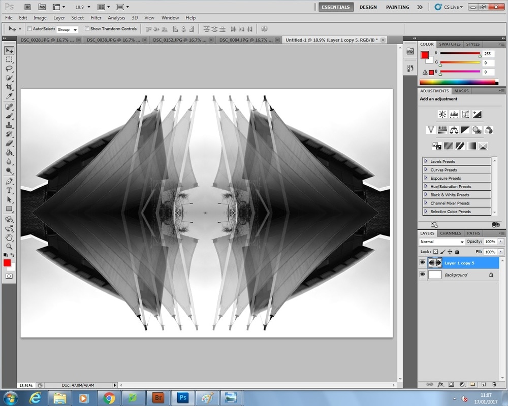
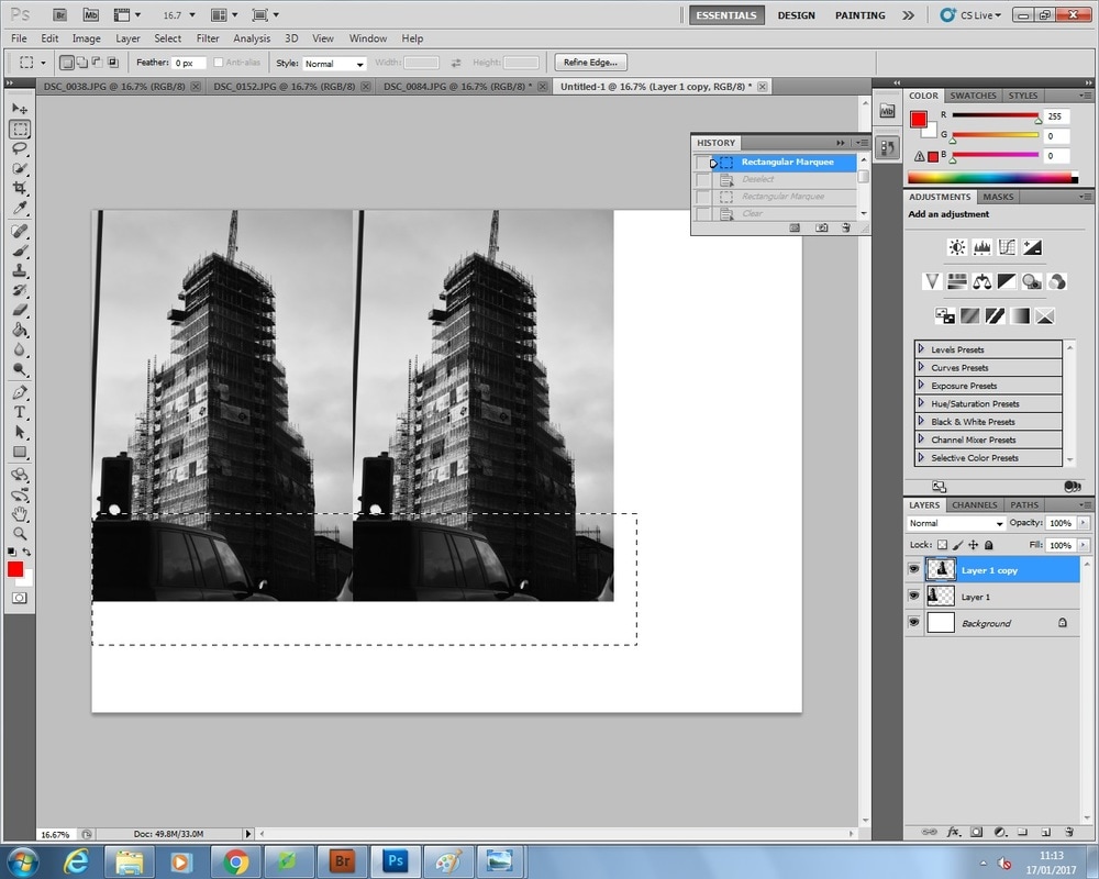
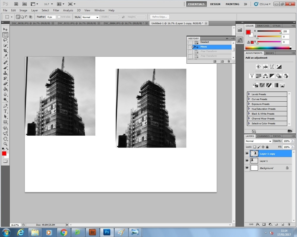
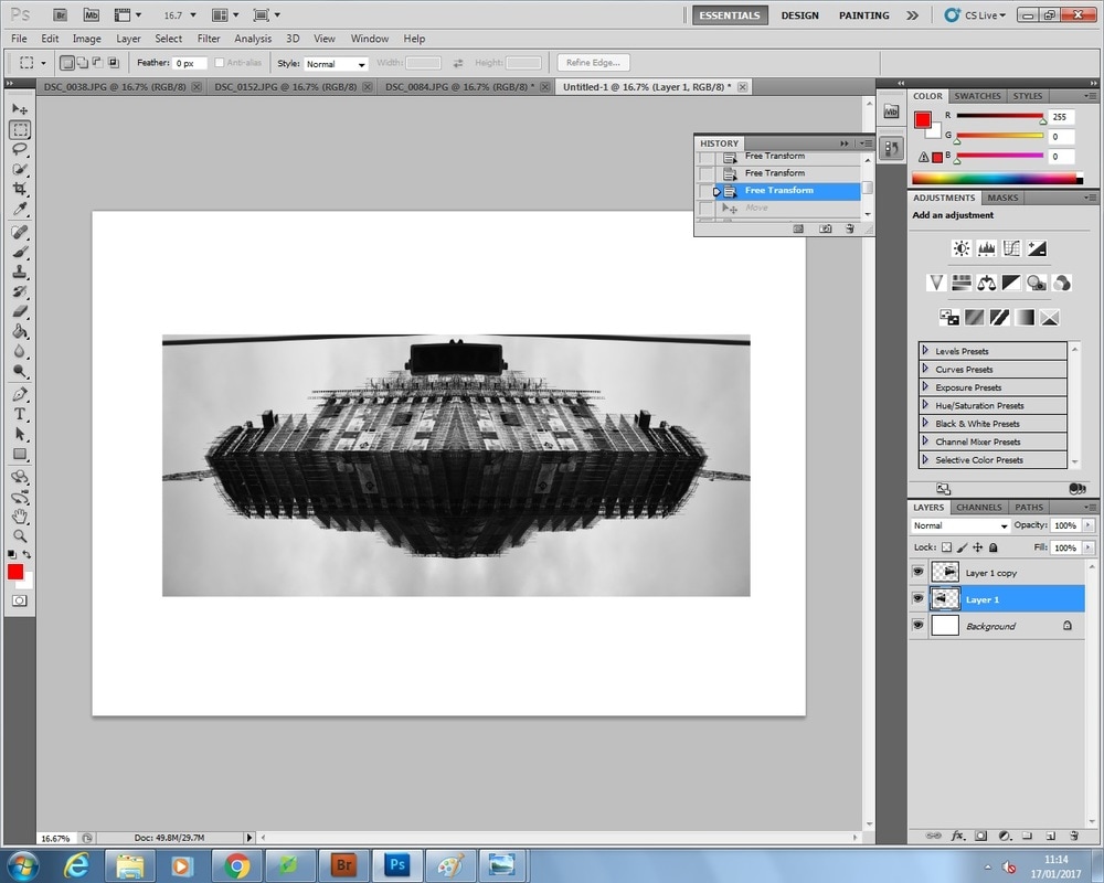
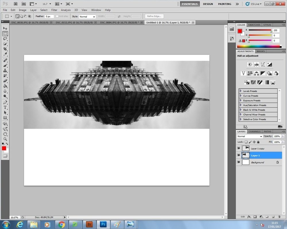
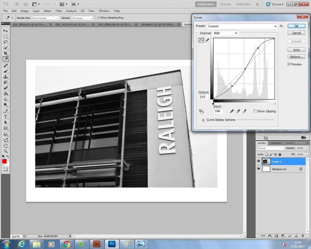
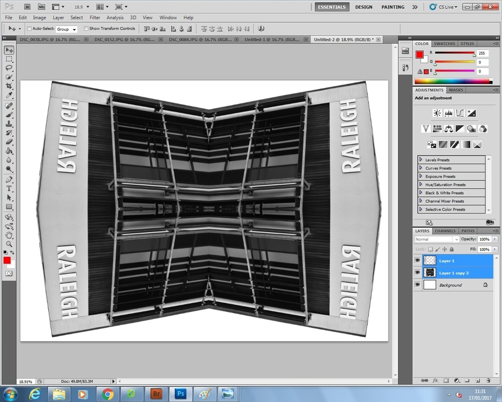
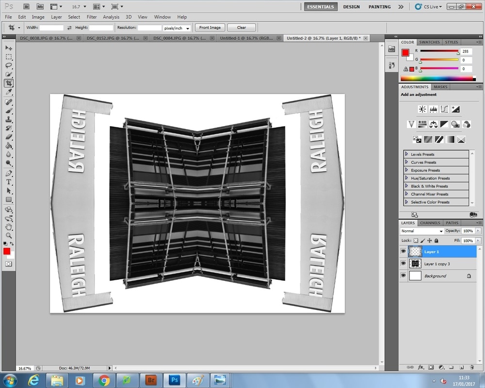
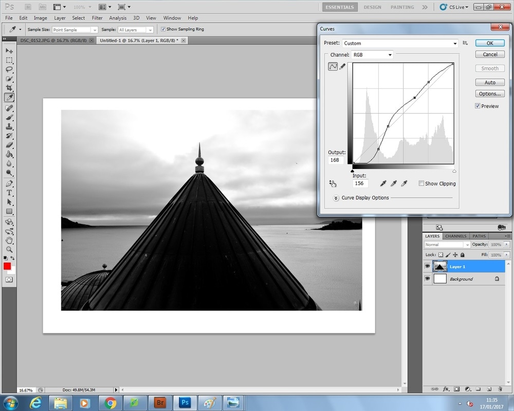
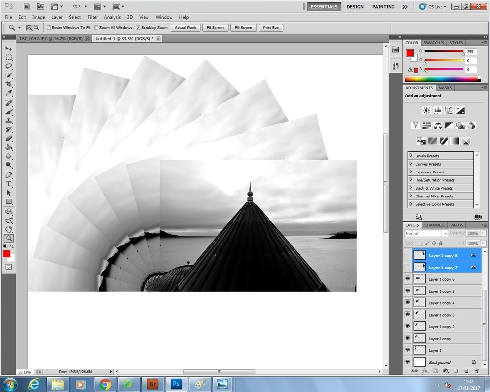
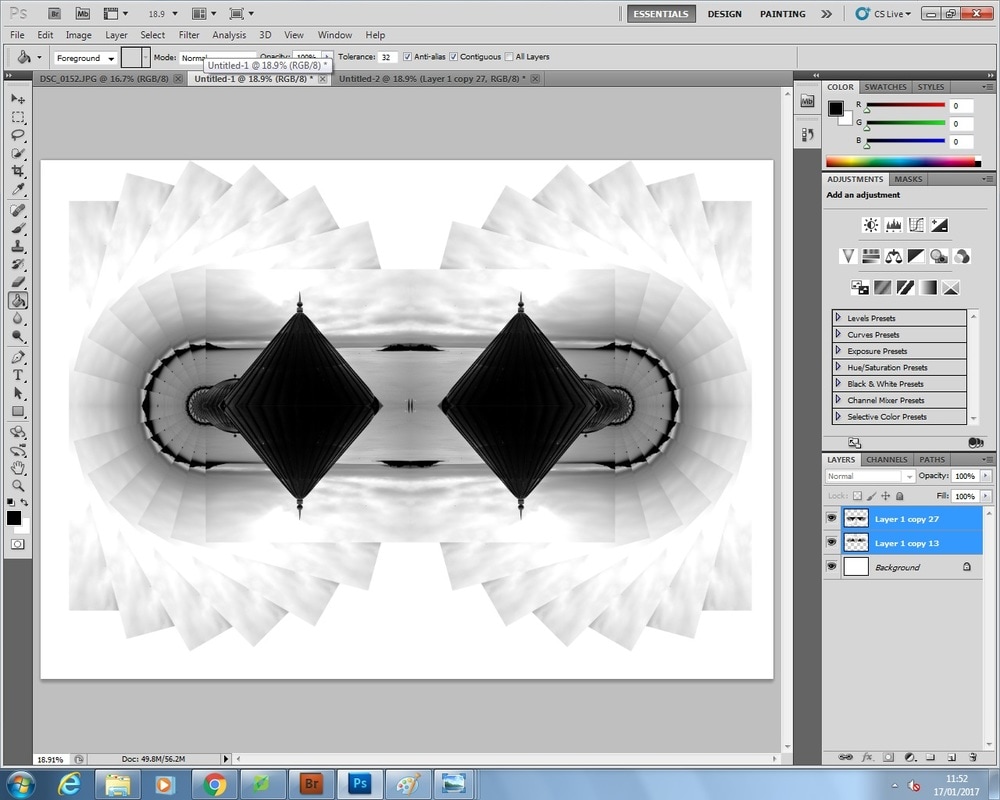
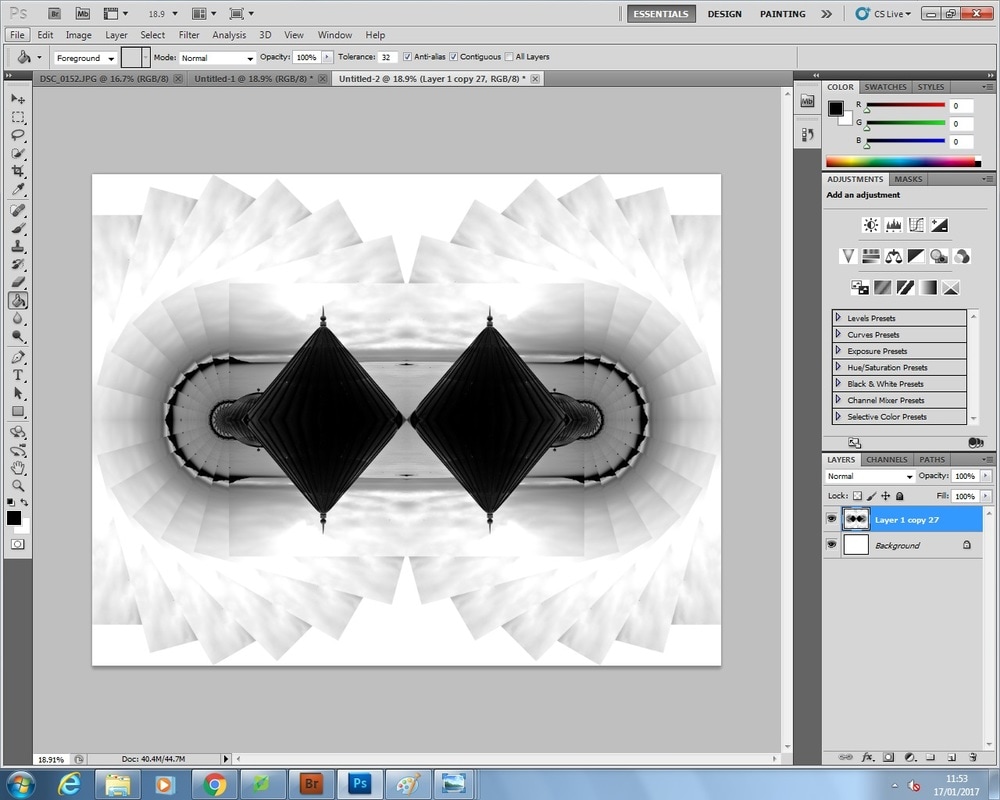
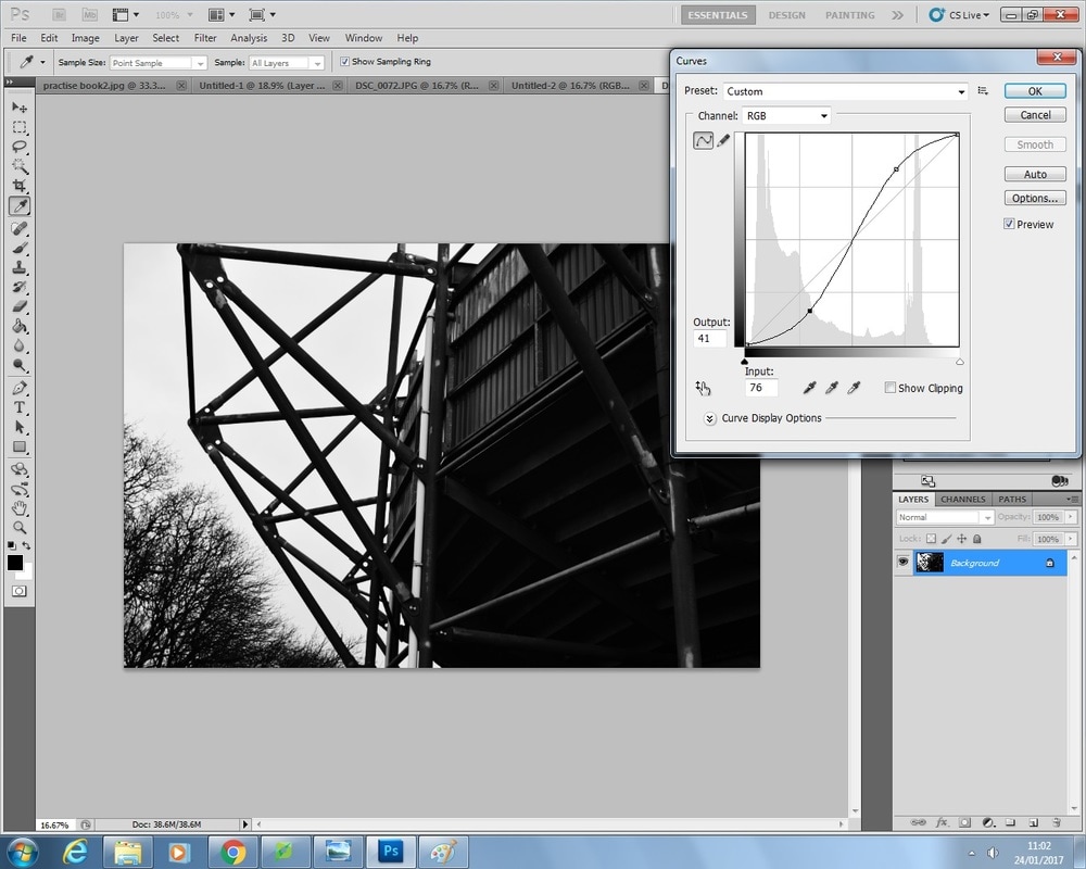
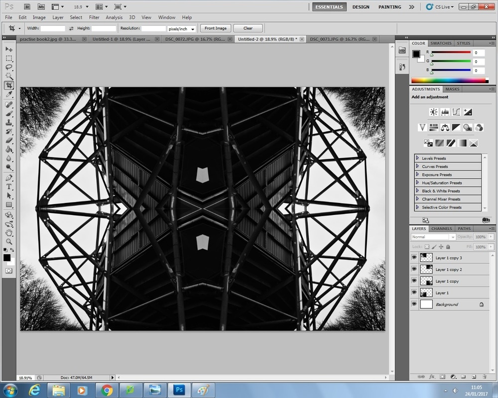
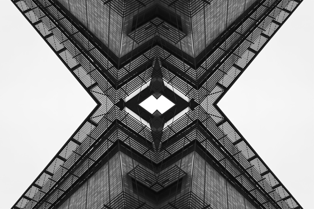
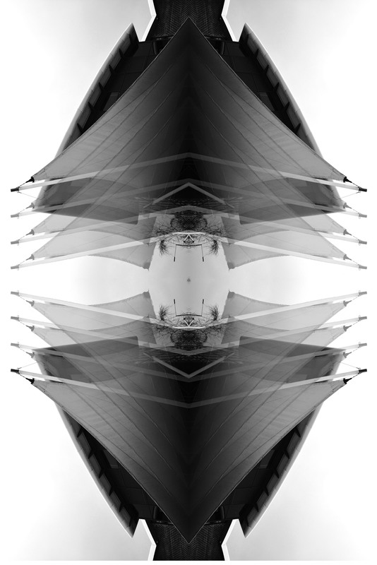
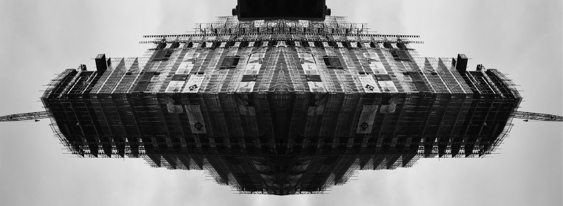
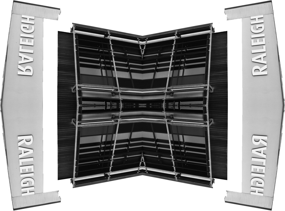
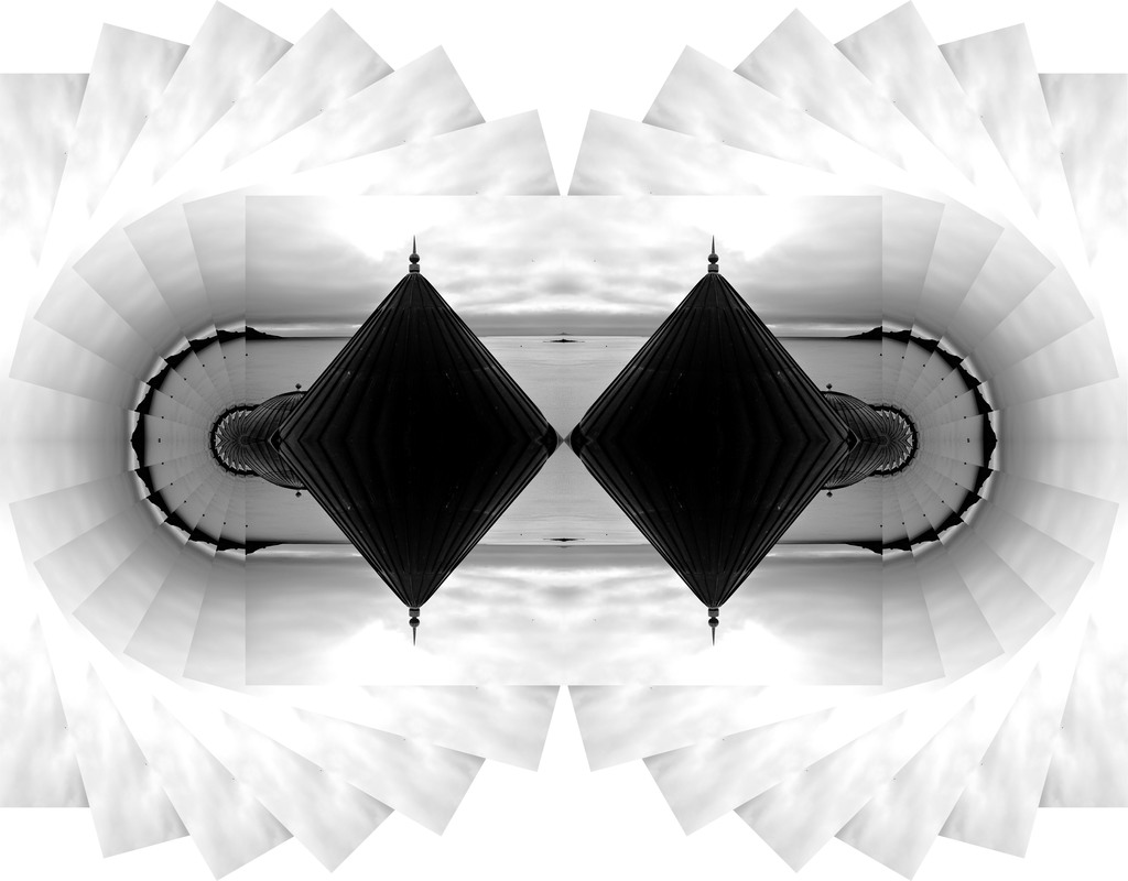
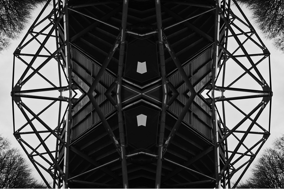
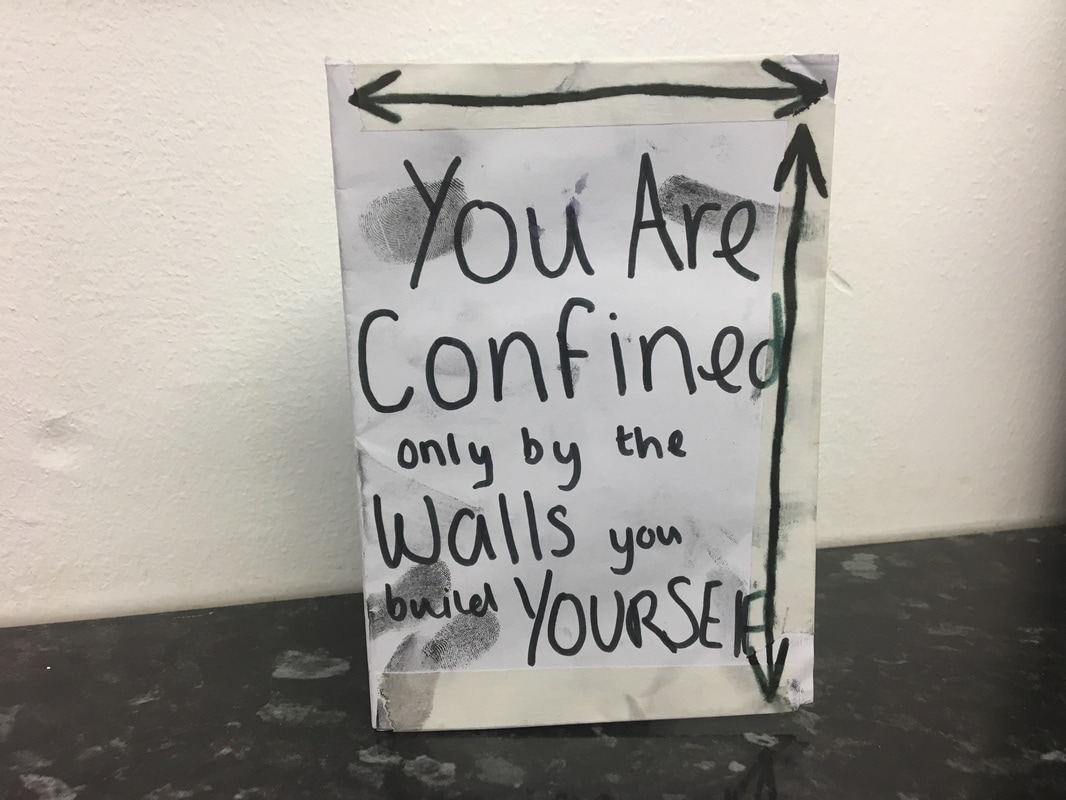
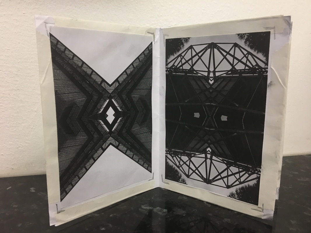
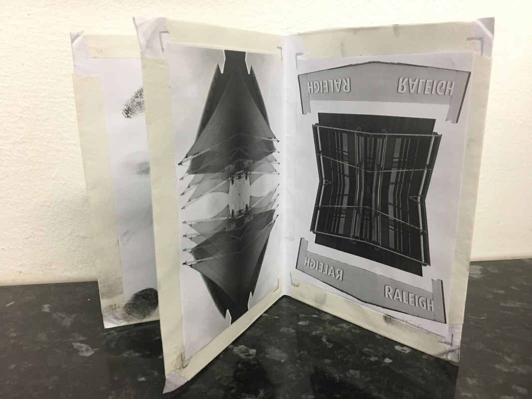
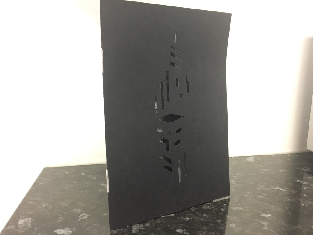
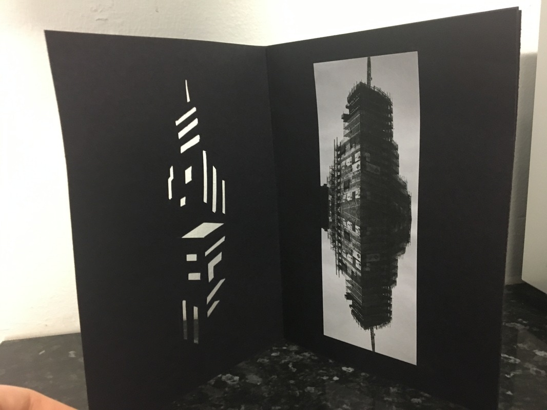
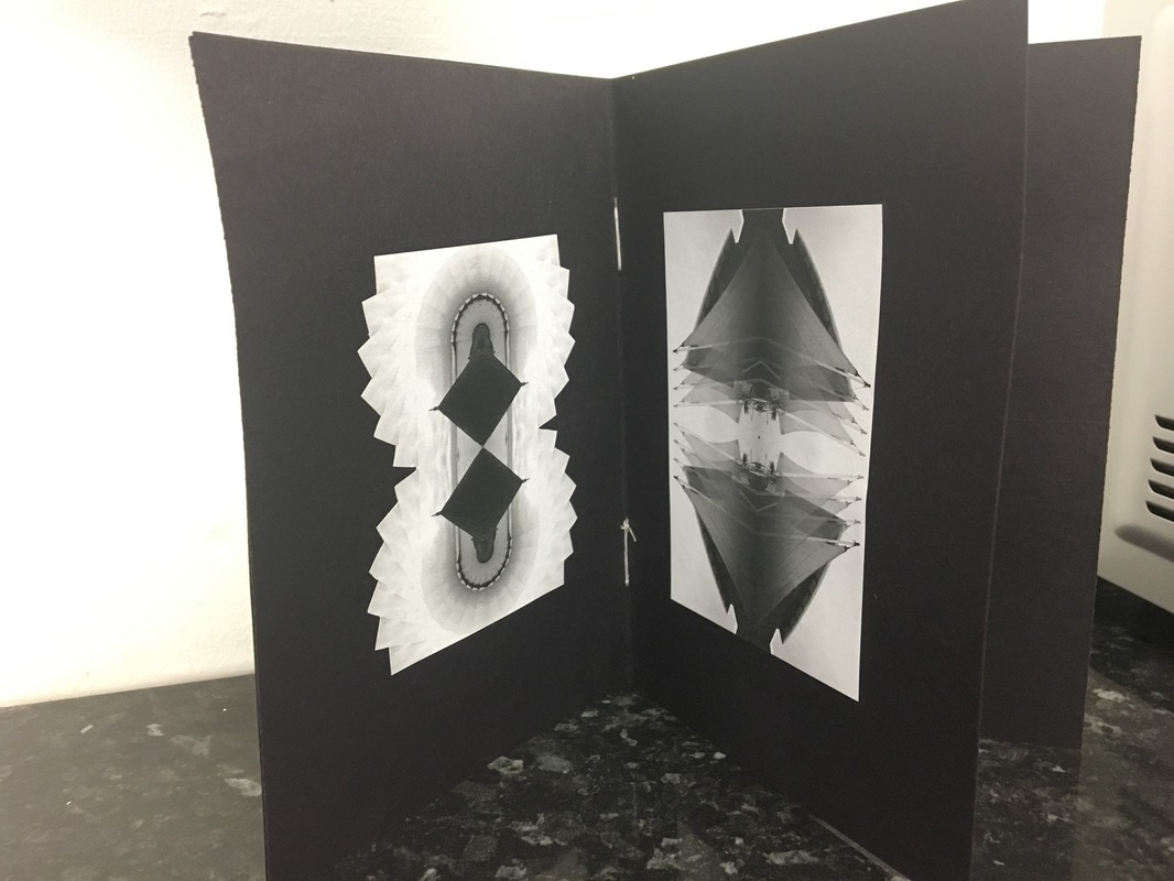
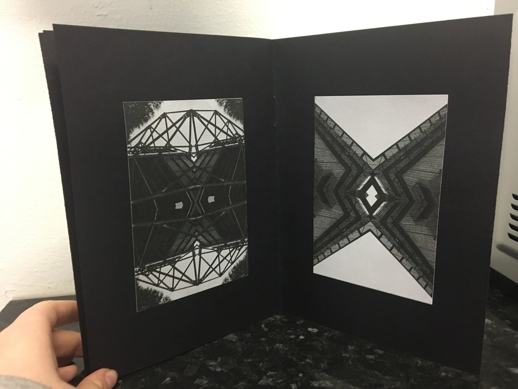
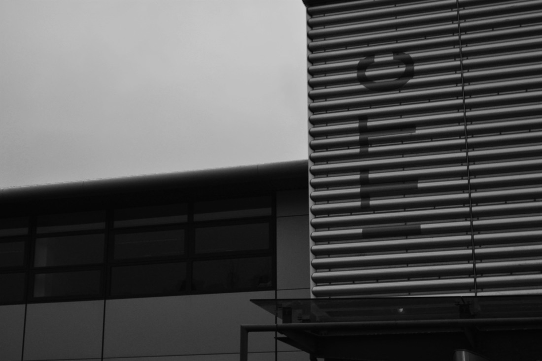
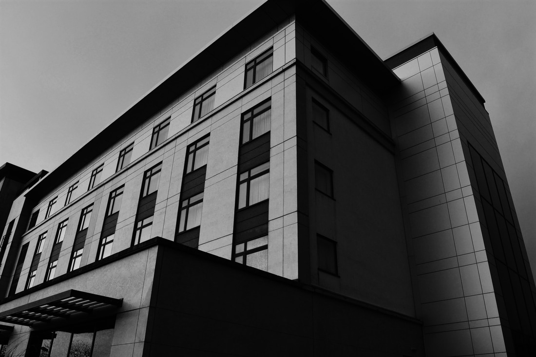
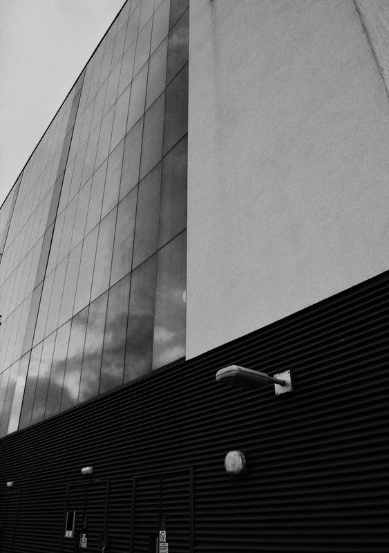
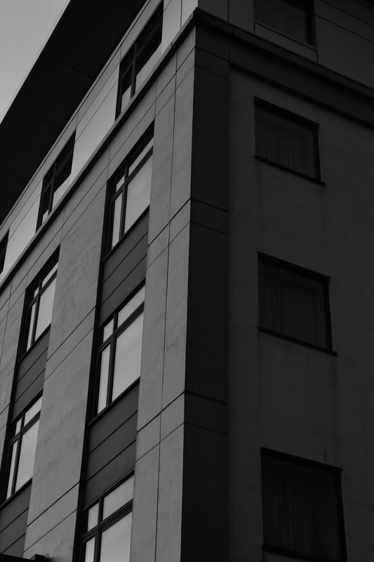
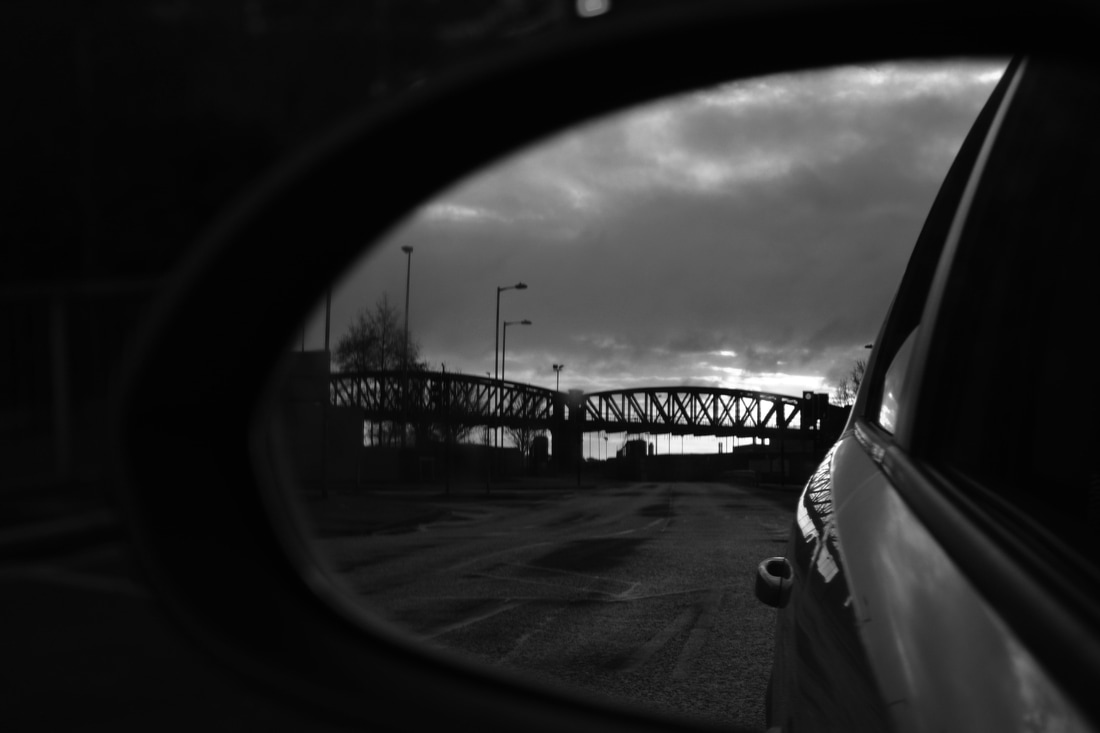
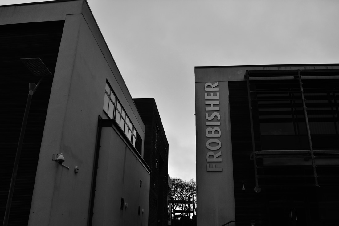
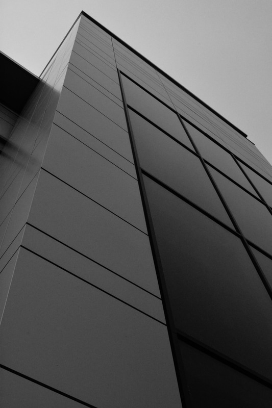
I'm really interested in architecture photography, it's my favourite thing to photograph and I love abstraction of buildings. In the last year I've discovered photographers Mike Hollman and Johnny Kerr who I've become obsessed with, Kerr in particular. I love his work and how his images look like they've been mirrored even though they're the actual buildings. I love repetition in images, especially architecture. I love how you can change the image so much that you can't tell what they were in the first place. For my shoot I will do one inspired by Johnny Kerr. I'm obsessed with his work and the meaning behind his images. The way he will change the POV of a building and change it completely, how he'll use black and white and extreme contrast to enhance his images, something I hope to do with mine once I've edited them. Johnny Kerr's blogI'm in awe with Kerr's work, I love it and will look at it for hours. I love the rich tones in the buildings, the greys and blacks and the shadows as well, they're so incredible. I love the texture and detail in the images too. He does a range of images but I've focused on his architectural ones mainly and ones that look like they've been flipped and duplicated. The way that his images all have similar backgrounds and they all link is really clever and I think portrays the minimalist vision he's got going on. All his images are took from a low view point which can show a potential show of power maybe, having us down below and having to look up at what we see. I think this repetition of colour, viewpoint and shadows/tones are incredible and create a signature style. I've accepted that my initial images from my shoot will be of poorer quality, and won't look impressive but I'm hoping that once I've edited them into the image I want, that it'll be a lot more successful. People seem to forget that the image you see online, that photographers share with the world, aren't the images that they took initially, they've been played and toyed with excessively and created into the work they are now. SHOOT ONEFor this shoot, I went round different areas of Plymouth and took images of interesting buildings and architecture. In my head I already had a vision of what I wanted to do so when taking these images so I knew what to look for and what to take and the angle of the photo etc. I took the majority of my images at a low view point and tried to get different colours/patterns in each one so when the image got edited: it would be successful. As I took my images, I visualised how I would edit them and what I could do. For my final images, I want all of them in black & white. However I don't like having a lack of control over my photos so I took them in colour and will then put them in black and white myself otherwise I don't have any other option but to have them in black and white, even though I will probably have them like that anyway. The images I plan on using are a couple of the images from the football ground, the Life Centre and potentially some of the ones I took of the hotel in the top left of the first PDF. EDIT'S LOGSSo in order to get my final images I had to manipulate all my chosen ones into completely different images, to make a new one with new thoughts created further from that image. Although I had a few basic ideas, I went on photoshop with a very little plan on what I was going to do. I experimented with my first image, came out with a really good outcome and decided to use that technique with the rest of my images. I wanted to have really strong and bold blacks contrasting with crisp whites, although I love the use of greys and shadows, I felt that my images would look stronger with vivid lines and designs that differed from each one rather than a boring monotone shade. I wanted the viewer to remember each individual image and not forget a single one or get any mixed up because they were all so similar. EDIT ONE EDIT TWO I had a really good idea of duplicating this flag and dragging it slightly over each time but lowering the opacity. I wanted to do this to take the vision away from it being a building and putting it into a different perspective. EDIT THREE I love this edit, the tones are so rich and contrast so well and the sky is so dark and moody. I wouldn't have got this effect if I hadn't of used curves. The image itself is really rubbish in colour and was took out a car window whilst we were moving so before I edited it, it just looked really poor quality. EDIT FOUR EDIT FIVE I'm not quite sure why I did this or where it came from, I started doing this and realised it looked quite interesting and liked the idea of the image having the curved edges. You can't tell what the original image was which was my goal. It isn't my favourite edit but I'm still happy with it. EDIT SIX FINAL IMAGESIn general my edits went really well, I achieved what I wanted and I feel they will work successfully in my book with what I want to do. The way I did it all in black and white went well and wouldn't have worked if it was in colour. The way I mirrored them went well and I'm just generally happy with them. I think my favourite edits is the one of the building in construction because of the tones and lighting and the other one just below it of Argyle because of the construction of the buildings and the lines. ZINES 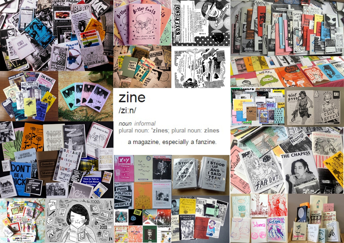 A zine is a self published book shortened from fanzine or magazine. They're usually designed and published with the desire of self expression or to get their voices heard rather than to make a profit, they have low budget too. They're small and low-key, usually self distributed too. They're known to be outside the mainstream and it's own culture, attracting a community among creators and the people who read zines. They're independent and the creators follow their own rules. They're usually folded, stapled, printed and bound. They became increasingly popular with the rise of the punk subculture in the 70's with the new interest in self publishing. They have a habit of everything that was normally 'supposed' to be hidden being brought to the front, both literally and figuratively. Furthermore, there's a sub-category of zines called 'perzines', shortened from personal zines, which are zines written about personal experiences, opinion and observations. This seems to be the largest used format for zines today. I aim to present my work in a zine like form, similar physical layout and vision of self expression, but a little less explicitly with a lack of opinions and political views like a lot of zines have. I'll be purely creating one as a vision for my work. ZINE ONE
ZINE TWO
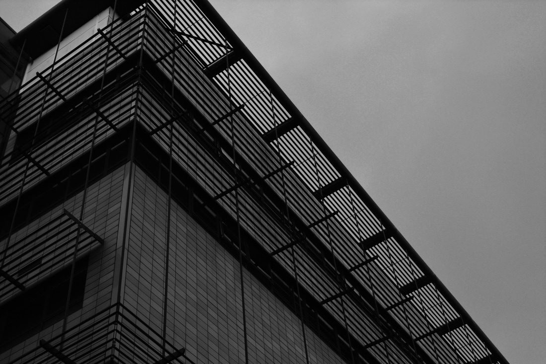
POTENTIAL IMPROVEMENTS?After completing my book, I looked back at Johnny Kerr and his images and noticed how different my work was yet similar at the same time. His compositions were all natural whereas mine had been developed and photoshopped and are artificial. Therefore I decided to do a couple of other edits with different images that were a lot more basic and like Kerr's work. These images look so much more classy and chic, the detail in the buildings and the use of black and grey rather than black and white are a lot more like Kerr's work and contrasts with how I developed my ideas and my work with my previous images. As much as I like these new images and edits, I'm glad with what I did, how I edited mine and the style I created because it created the impact I wanted. I wanted each image to be individual and different from the next one whilst still creating a pattern. And I feel I achieved this well.
0 Comments
Leave a Reply. |